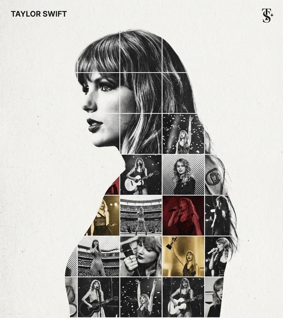
提示词大全
探索、发现并复制高品质 AI 提示词。
在 Shard X,为你的 AI 助手注入灵魂。
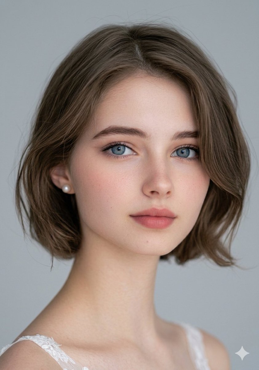
超写实蓝眼少女特写肖像
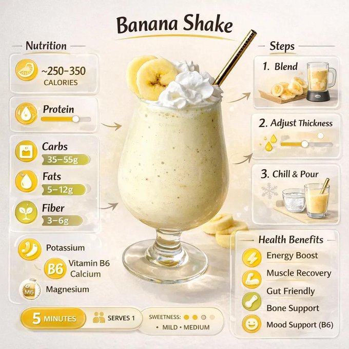
极简饮品营养海报
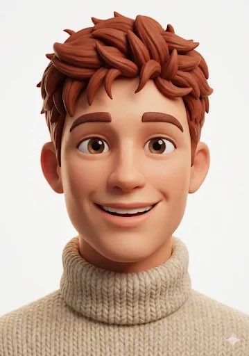
皮克斯风金发雀斑少女的头像
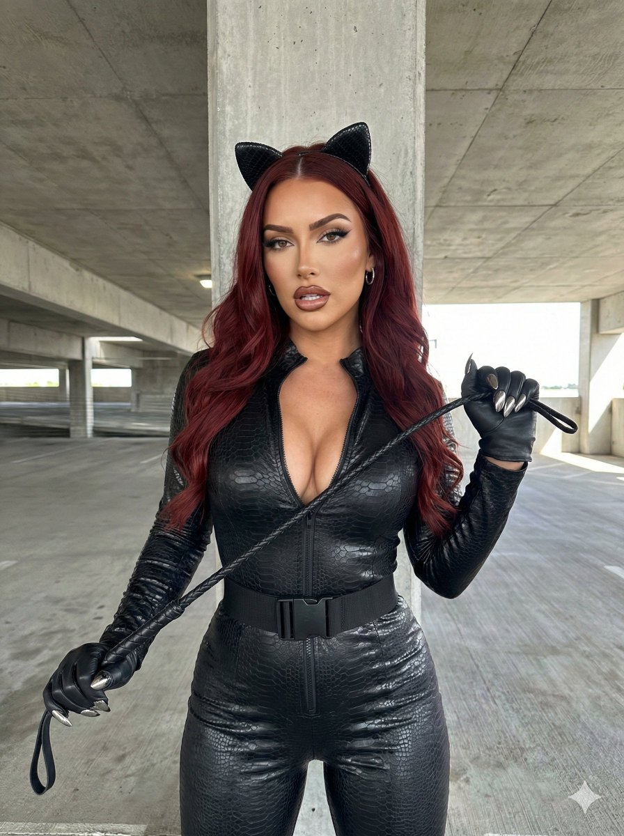
地下车库的冷艳猫耳御姐
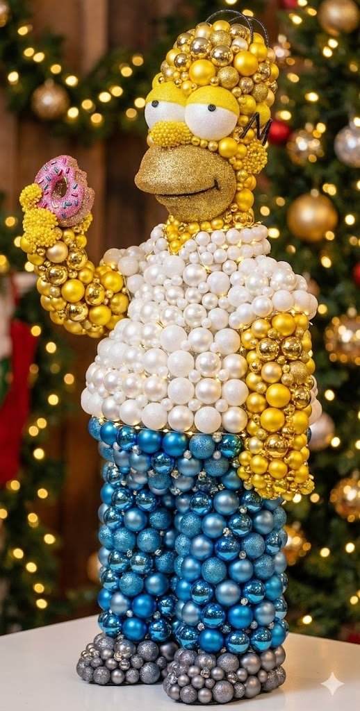
细腻光影下的金属亮片圣诞球雕塑

俏皮少女垂钓汉堡波普艺术照
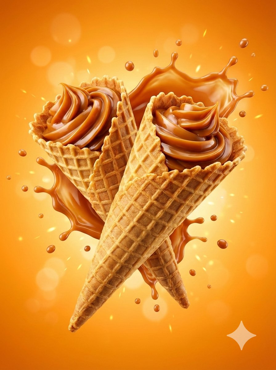
悬浮焦糖蛋筒甜品大片
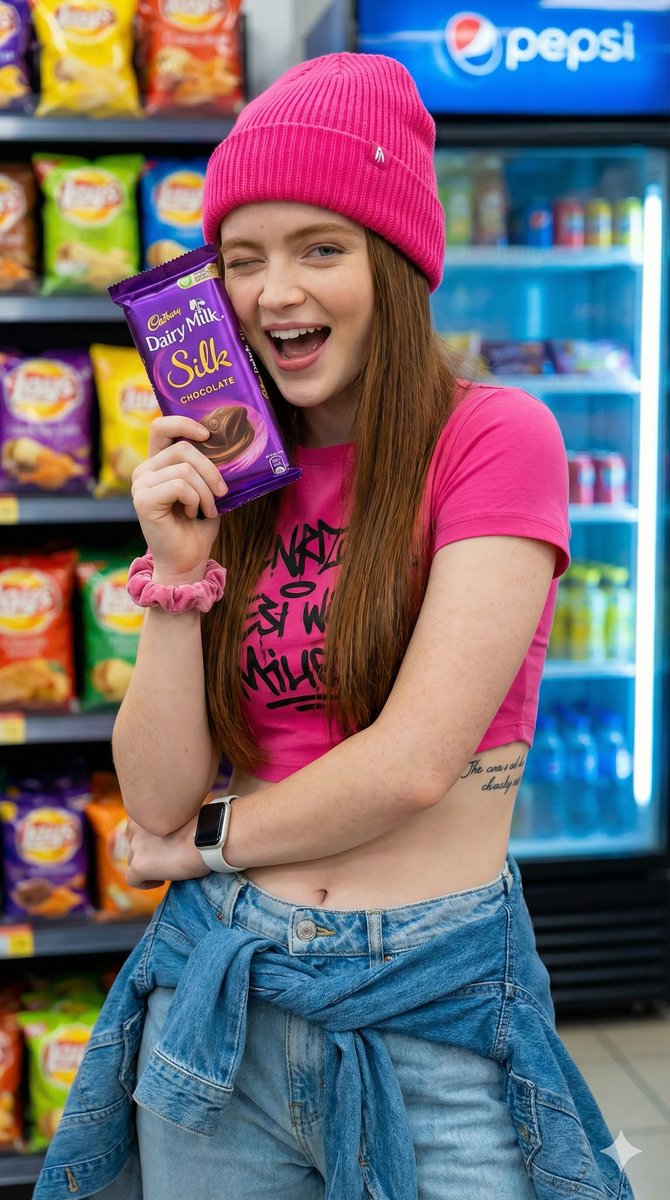
超市活力少女瞬间
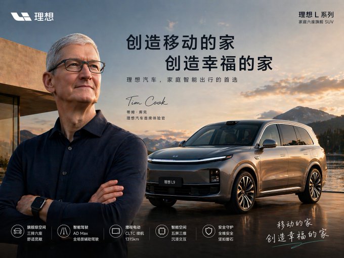
明星代言汽车海报

搭载兔子图腾的硬核实体AI
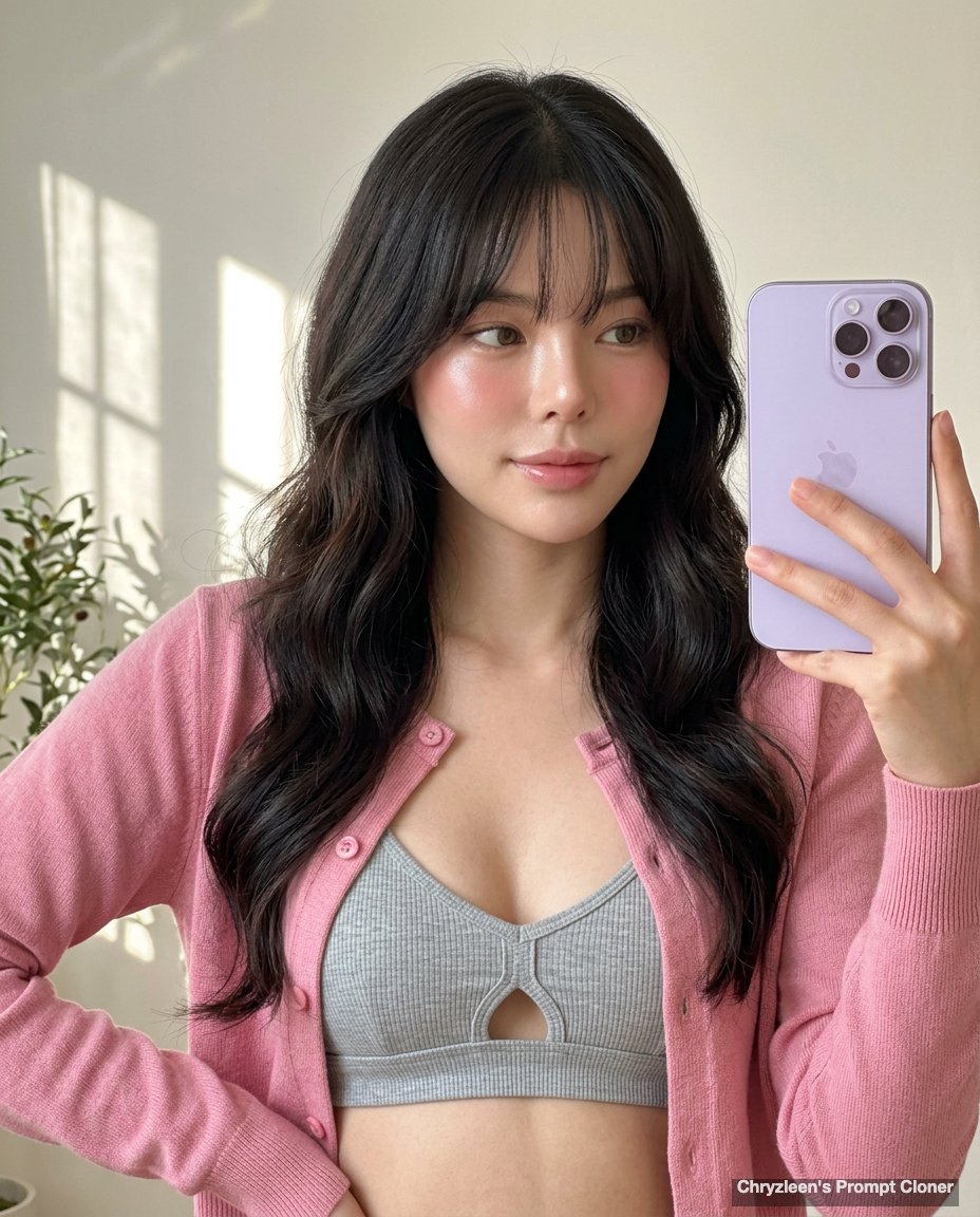
暖阳下的玻璃肌少女自拍
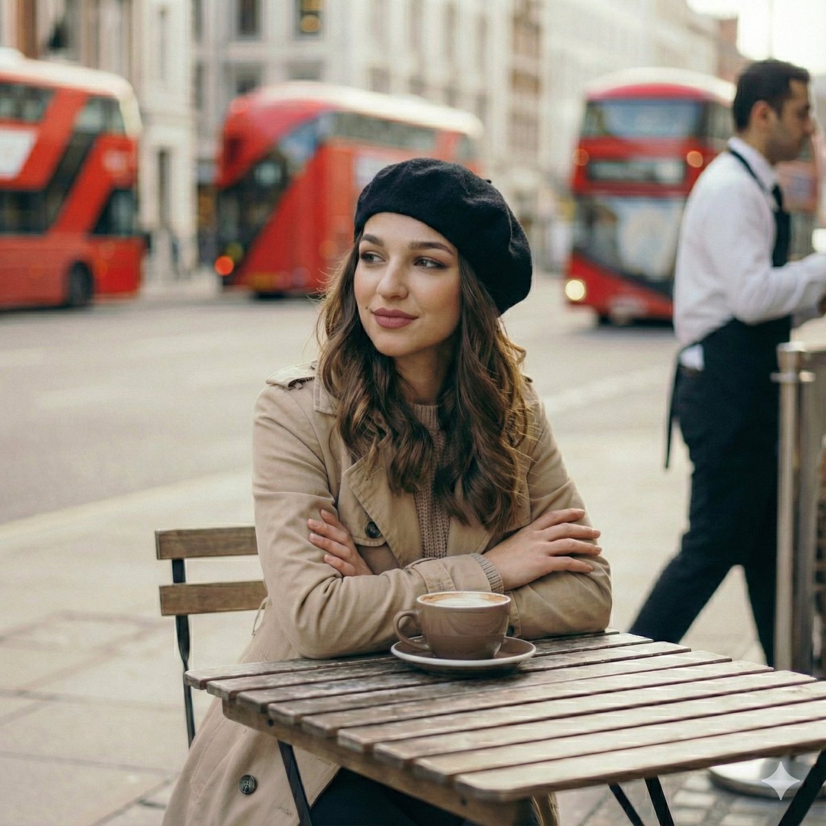
伦敦早春清晨咖啡馆的静谧时光少女
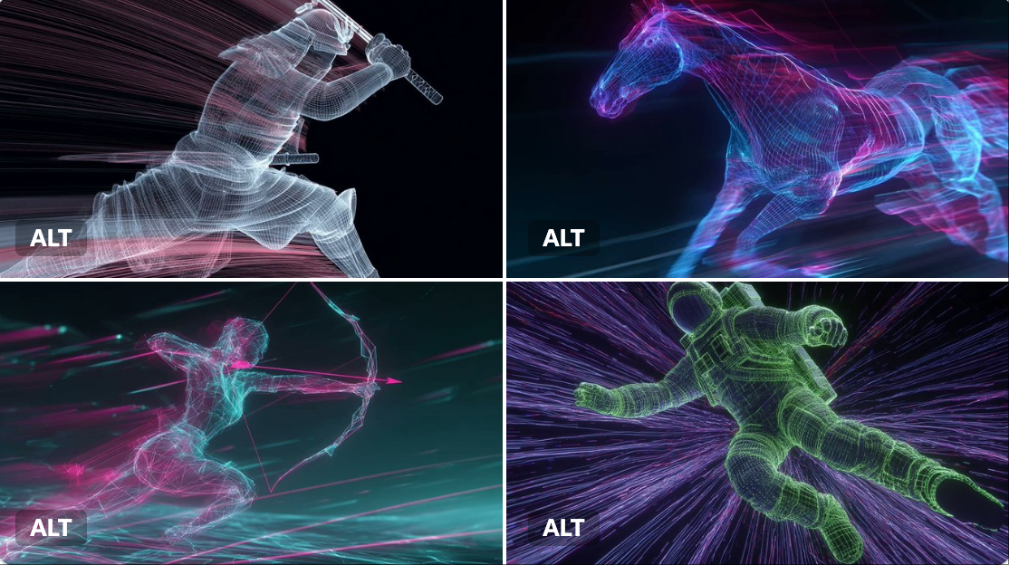
霓虹灯线框
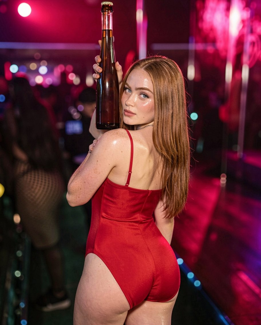
霓虹夜店红衣女郎的迷人回眸
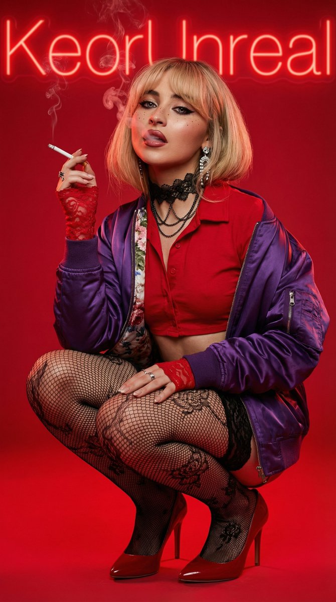
超写实红唇金发女郎抽烟前卫肖像
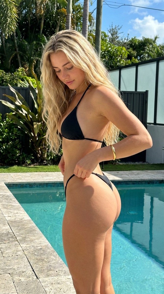
烈日泳池畔的极致沙漏尤物
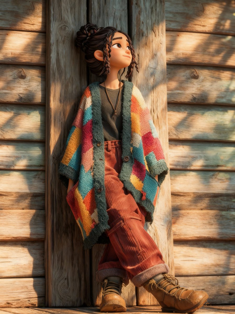
治愈系皮克斯风格秋日暖阳少女
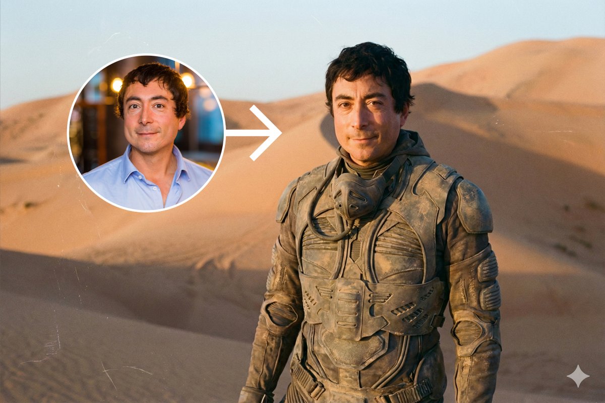
《沙丘》电影同款废土风沙漠人像写真
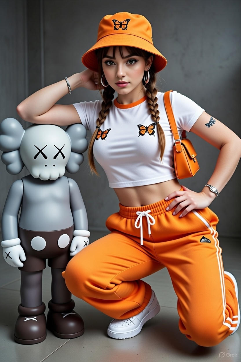
女性站在KAWS风格艺术雕塑旁
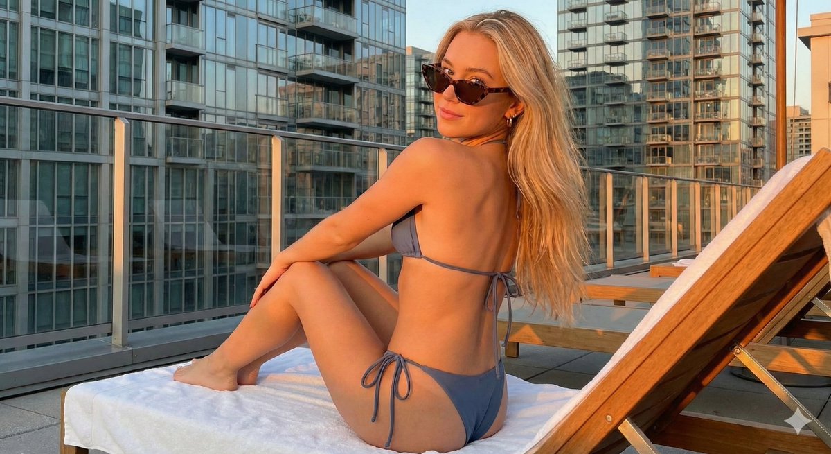
黄金时刻都市天台夏日写真
创作一张精致、画廊品质的致敬海报,以人物肖像剪影为中心,剪影内部填充纹理照片马赛克。设计应具有触感、层次感和高级感,而非扁平的数字拼贴作品。 核心结构:载体 核心焦点必须是 [人物姓名] 的大型、高对比度黑白肖像剪影。此剪影作为内部视觉叙事的容器。它必须完美居中于画布。网格填充和混合媒体纹理 剪影内部应填充由该人物职业生涯中的动作照片组成的密集照片马赛克网格。关键纹理方向 请勿粘贴扁平照片。每个网格单元都应经过艺术处理,以营造出触感、拼贴般的美感。在不同的单元格中选择性地融入以下纹理:半色调点(漫画书风格的栅格图案)、织物或刺绣纹理(暗示球衣材料或缝制补丁)、高对比度动作照片上的胶片颗粒或重噪点。最终效果应感觉像是手工制作和分层的,而非数字组装。 色彩策略 基础调色板:单色黑白。仅在特定网格单元上引入选择性色彩叠加。强调色应与相关团队、品牌或国旗相关。谨慎使用色彩,以营造视觉节奏和强调。 排版和品牌——严格的微缩比例 左上角(姓名)使用 Inter Semibold 字体书写“[人物姓名]”。字距调整:紧密的负字距,大小:小而低调。姓名最多只能占据画布总宽度的 20%。请勿将其做得过大或过于突出。 右上角(符号)放置主要标志(团队、品牌或旗帜)。大小:非常小。它最多只能占据画布总宽度的 10%。 构图和背景 背景 使用米白色或浅灰色。包含清晰可见的高品质纸张纹理或微妙的混凝土纹理。避免扁平的数字白色。 对齐 剪影精确居中。人物周围保留充足的负空间,以保持优雅和平衡。
Create a refined, gallery-quality tribute poster built around a central portrait silhouette filled with a textured photo mosaic. The design should feel tactile, layered, and premium not like flat digital collage work. Central Structure : The Vessel The central focus must be a large-scale, high-contrast black and white portrait silhouette of [Persons name]. This silhouette acts as the container for the internal visual narrative. It must be centered perfectly on the canvas. The Grid Fill and Mixed Media Textures The interior of the silhouette should be populated by a dense photo mosaic grid made from action shots throughout the person’s career. Critical Texture Direction Do not paste flat photos. Each grid cell should have artistic treatment to create a tactile, collage-like aesthetic. Incorporate a mix of the following textures selectively across different cells: Halftone dots (comic-book style raster patterns) Fabric or embroidery textures suggesting jersey material or stitched patches Film grain or heavy noise on high-contrast action shots The result should feel handcrafted and layered rather than digitally assembled. Color Strategy Base palette: monochrome black and white. Introduce selective color overlays only on specific grid cells. The accent colors should relate to the relevant team, brand, or national flag. Use color sparingly to create visual rhythm and emphasis. Typography and Branding – Strict Micro-Scaling Top Left (The name) Write “[person name]” using the font Inter Semibold. Kerning: tight negative kerning , Size: small and discreet. The name must occupy a maximum of 20% of the total canvas width. Do not make it large or dominant. Top Right (The symbol) Place the primary logo (Team, Brand, or Flag). Size: very small. It must occupy a maximum of 10% of the total canvas width. Composition and Background Background Use off-white or light grey. Include a visible high-quality paper or subtle concrete texture. Avoid flat digital white. Alignment Center the silhouette precisely. Maintain generous negative space around the figure to preserve elegance and balance.